---
title: "Customer Churn Prediction Analysis"
subtitle: "CIS 9660 - Data Mining for Business Analytics"
author:
- "Harrison Cabe"
- "Raúl J. Solá Navarro"
- "Samuel Spitzer"
- "Victor Murra Schott"
date: "May 15, 2026"
format:
html:
theme: cosmo
toc: true
toc-depth: 3
number-sections: true
code-fold: true
code-tools: true
self-contained: false
execute:
echo: true
warning: false
message: false
---
## Introduction
Customer churn refers to customers who cancel or stop using a company's service. ^[In this
dataset, churn is measured as a binary snapshot: each customer is labeled as churned or
retained based on whether they left within the last month of the observation window. It does
not capture how long a customer was at risk or when exactly they left, so churn rate here
means the proportion of customers in the sample who churned during that period
(26.6% of 7,032 customers).] In the telecom industry, losing customers is expensive because
bringing in new ones costs significantly more than keeping existing ones. ^[Gallo, A. (2014).
The value of keeping the right customers. *Harvard Business Review*.
https://hbr.org/2014/10/the-value-of-keeping-the-right-customers. Gallo synthesizes research
by Frederick Reichheld of Bain & Company showing that acquiring a new customer costs 5 to 25
times more than retaining an existing one, and that a 5% increase in retention rates can
boost profits by 25% to 95%.] Being able to identify which customers are likely to leave
before they actually do gives companies a chance to step in with a targeted offer or
intervention.
This project uses the *Kaggle Telco Customer Churn* dataset ^[An IBM sample dataset of a
fictional telecommunications company.] to answer the following question: **Can we predict whether a telecom customer will churn based on their contract type, monthly charges, and service usage?** We build and compare `logistic regression models`, evaluate their performance using `standard classification metrics`, and translate the results into `business recommendations`.
The analysis has two goals. The first is **predictive**: build a model that correctly classifies customers as likely to churn or stay. The second is **inferential**: test whether the combination of `InternetService` type and `Contract` type has a meaningful effect on churn beyond what each variable contributes on its own and, specifically, whether certain contract-service pairings carry risk that neither variable alone can fully explain.
## Dataset Description
The dataset comes from [Kaggle's Telco Customer Churn](https://www.kaggle.com/datasets/blastchar/telco-customer-churn) and covers `7,043` customers of a fictional telecommunications company. It includes `21` variables ^[The raw dataset contains 21 columns. `customerID` is dropped immediately
as a non-predictive identifier. The 13 binary Yes/No columns are encoded in place with
`.map()` and do not change the column count. One-hot encoding with `drop_first=True`
then expands three categorical columns: `InternetService` (3 levels → 2 dummies),
`Contract` (3 levels → 2 dummies), and `PaymentMethod` (4 levels → 3 dummies), adding
a net of 4 columns. This gives 24 columns total. `TotalCharges` is then excluded from
the model due to its near-perfect collinearity with `tenure` (r = 0.83), leaving
**23 features** used in modeling.] across demographics, subscribed services, and account details, with `Churn` (Yes/No) as the target variable.
The predictor variables fall into three groups:
- **Demographics:** `gender`, `SeniorCitizen`, `Partner`, `Dependents`
- **Services:** `PhoneService`, `MultipleLines`, `InternetService`, `OnlineSecurity`, `OnlineBackup`, `DeviceProtection`, `TechSupport`, `StreamingTV`, `StreamingMovies`
- **Account:** `Contract`, `tenure`, `MonthlyCharges`, `TotalCharges`, `PaymentMethod`, `PaperlessBilling`
```{python}
#| label: setup
import pandas as pd
import numpy as np
import matplotlib.pyplot as plt
import seaborn as sns
from sklearn.preprocessing import StandardScaler
from sklearn.model_selection import train_test_split, StratifiedKFold, cross_validate
from sklearn.linear_model import LogisticRegression
from sklearn.metrics import (classification_report, roc_auc_score,
                             confusion_matrix, RocCurveDisplay, make_scorer, recall_score)

URL = "https://raw.githubusercontent.com/RaulSolaNavarro/CIS9660-2026-SPRING/main/data/Telco-Customer-Churn.csv"
df = pd.read_csv(URL)

# ── Cleaning (Sammy) ──────────────────────────────────────────────────────────
df['TotalCharges'] = pd.to_numeric(df['TotalCharges'], errors='coerce')
n_dropped = int(df['TotalCharges'].isnull().sum())
df = df.dropna()

# Collapse "No <service> service" into "No" (Sammy)
df['MultipleLines']     = df['MultipleLines'].replace('No phone service', 'No')
df['OnlineSecurity']    = df['OnlineSecurity'].replace('No internet service', 'No')
df['OnlineBackup']      = df['OnlineBackup'].replace('No internet service', 'No')
df['DeviceProtection']  = df['DeviceProtection'].replace('No internet service', 'No')
df['TechSupport']       = df['TechSupport'].replace('No internet service', 'No')
df['StreamingTV']       = df['StreamingTV'].replace('No internet service', 'No')
df['StreamingMovies']   = df['StreamingMovies'].replace('No internet service', 'No')

# Binary encoding using .map() (Sammy)
df['gender']            = df['gender'].map({'Male': 1, 'Female': 0})
df['Partner']           = df['Partner'].map({'Yes': 1, 'No': 0})
df['Dependents']        = df['Dependents'].map({'Yes': 1, 'No': 0})
df['PhoneService']      = df['PhoneService'].map({'Yes': 1, 'No': 0})
df['PaperlessBilling']  = df['PaperlessBilling'].map({'Yes': 1, 'No': 0})
df['Churn']             = df['Churn'].map({'Yes': 1, 'No': 0})
df['MultipleLines']     = df['MultipleLines'].map({'Yes': 1, 'No': 0})
df['OnlineSecurity']    = df['OnlineSecurity'].map({'Yes': 1, 'No': 0})
df['OnlineBackup']      = df['OnlineBackup'].map({'Yes': 1, 'No': 0})
df['DeviceProtection']  = df['DeviceProtection'].map({'Yes': 1, 'No': 0})
df['TechSupport']       = df['TechSupport'].map({'Yes': 1, 'No': 0})
df['StreamingTV']       = df['StreamingTV'].map({'Yes': 1, 'No': 0})
df['StreamingMovies']   = df['StreamingMovies'].map({'Yes': 1, 'No': 0})

# Fix TotalCharges dtype (Sammy)
df['TotalCharges'] = pd.to_numeric(df['TotalCharges'], errors='coerce')

# One-hot encode nominal multi-category columns (Sammy)
df = pd.get_dummies(df, columns=['InternetService', 'Contract', 'PaymentMethod'],
                    drop_first=True)

# Convert booleans from get_dummies to int (Sammy)
bool_cols = df.select_dtypes(include='bool').columns
df[bool_cols] = df[bool_cols].astype(int)

# Drop customerID
df = df.drop(columns=['customerID'])

# Keep a raw copy for EDA plots that need original category labels
df_raw = pd.read_csv(URL)
df_raw['TotalCharges'] = pd.to_numeric(df_raw['TotalCharges'], errors='coerce')
df_raw = df_raw.dropna()

# ── Inline values ─────────────────────────────────────────────────────────────
n_obs         = len(df)
churn_rate    = df['Churn'].mean()
no_churn_rate = 1 - churn_rate
total_charges_tenure_corr = df['TotalCharges'].corr(df['tenure'])

# EDA values from raw labels
contract_churn  = df_raw.groupby('Contract')['Churn'].apply(
    lambda x: (x == 'Yes').mean())
mtm_churn       = contract_churn['Month-to-month']
two_yr_churn    = contract_churn['Two year']

internet_churn  = df_raw.groupby('InternetService')['Churn'].apply(
    lambda x: (x == 'Yes').mean())
fiber_churn     = internet_churn['Fiber optic']

median_charges_churn    = df_raw[df_raw['Churn']=='Yes']['MonthlyCharges'].median()
median_charges_no_churn = df_raw[df_raw['Churn']=='No']['MonthlyCharges'].median()
median_tenure_churn     = df_raw[df_raw['Churn']=='Yes']['tenure'].median()
median_tenure_no_churn  = df_raw[df_raw['Churn']=='No']['tenure'].median()

tenure_churn_corr  = df['tenure'].corr(df['Churn'])
monthly_churn_corr = df['MonthlyCharges'].corr(df['Churn'])

# Pre-compute feature count: 23 base features (after dropping TotalCharges),
# expanded to 27 in the interaction model (+4 interaction terms)
n_features_base = df.drop(columns=['Churn', 'TotalCharges']).shape[1]  # 23
n_features_model = n_features_base + 4  # 27 with interaction terms
```
During data cleaning, `{python} f"{n_dropped}"` rows were dropped because `TotalCharges` was blank for customers with zero tenure (brand new accounts with no billing history yet), leaving a working dataset of `{python} f"{n_obs:,}"` observations. `TotalCharges` was also removed from the model because it is almost entirely determined by `tenure` (correlation of `{python} f"{total_charges_tenure_corr:.2f}"`), which would distort the model's coefficient estimates. The `Churn` column was converted to a binary integer (`1` = churned, `0` = stayed).
```{python}
#| label: tbl-summary
#| tbl-cap: "Dataset Overview"
#| echo: false
# Summary table
summary = pd.DataFrame({
'Variable': ['Observations', 'Features', 'Target', 'Churn Rate'],
'Value': [f'{n_obs:,}', str(df.shape[1] - 1), 'Churn (Yes/No)', f'{churn_rate:.1%}']
})
summary.style.hide(axis='index')
```
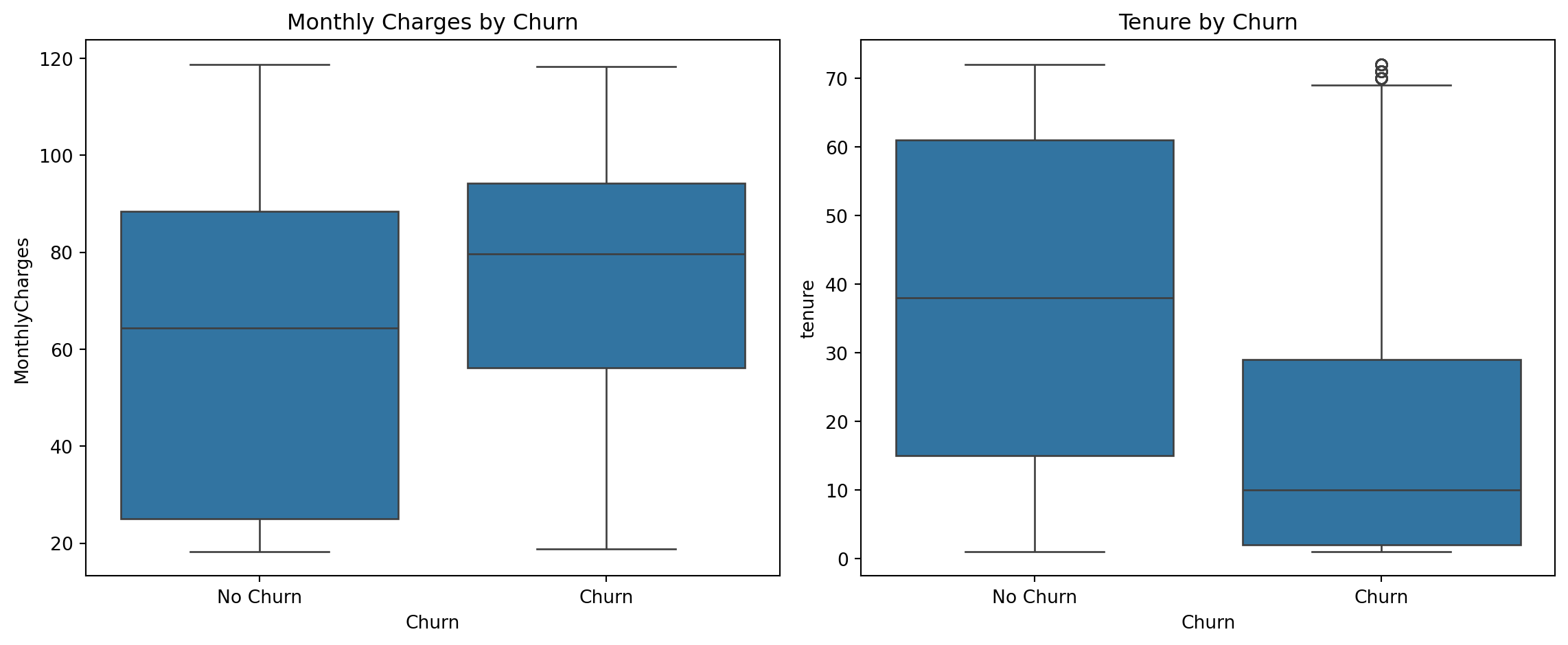
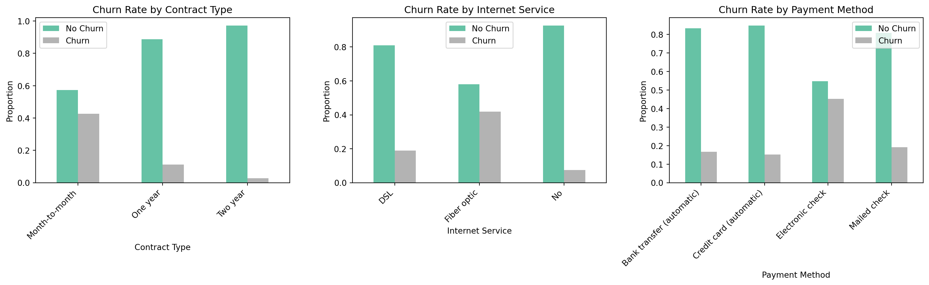
## Exploratory Data Analysis
Before building any models, we looked at how the key variables relate to churn. The dataset is moderately imbalanced: `{python} f"{no_churn_rate:.1%}"` of customers did not churn and `{python} f"{churn_rate:.1%}"` did.
```{python}
#| label: eda-plots
#| fig-cap: "Exploratory Data Analysis - Key Variables vs Churn"
# Boxplots (Sammy)
fig, axes = plt.subplots(1, 2, figsize=(12, 5))
sns.boxplot(x='Churn', y='MonthlyCharges', data=df_raw, ax=axes[0])
axes[0].set_title('Monthly Charges by Churn')
axes[0].set_xticklabels(['No Churn', 'Churn'])
sns.boxplot(x='Churn', y='tenure', data=df_raw, ax=axes[1])
axes[1].set_title('Tenure by Churn')
axes[1].set_xticklabels(['No Churn', 'Churn'])
plt.tight_layout()
plt.show()

# Bar charts by category (Sammy)
fig, axes = plt.subplots(1, 3, figsize=(16, 5))

contract_churn_plot = df_raw.groupby('Contract')['Churn'].value_counts(
    normalize=True).unstack()
contract_churn_plot.plot(kind='bar', ax=axes[0], colormap='Set2')
axes[0].set_title('Churn Rate by Contract Type')
axes[0].set_xlabel('Contract Type')
axes[0].set_ylabel('Proportion')
axes[0].set_xticklabels(axes[0].get_xticklabels(), rotation=45, ha='right')
axes[0].legend(['No Churn', 'Churn'])

internet_churn_plot = df_raw.groupby('InternetService')['Churn'].value_counts(
    normalize=True).unstack()
internet_churn_plot.plot(kind='bar', ax=axes[1], colormap='Set2')
axes[1].set_title('Churn Rate by Internet Service')
axes[1].set_xlabel('Internet Service')
axes[1].set_ylabel('Proportion')
axes[1].set_xticklabels(axes[1].get_xticklabels(), rotation=45, ha='right')
axes[1].legend(['No Churn', 'Churn'])

payment_churn_plot = df_raw.groupby('PaymentMethod')['Churn'].value_counts(
    normalize=True).unstack()
payment_churn_plot.plot(kind='bar', ax=axes[2], colormap='Set2')
axes[2].set_title('Churn Rate by Payment Method')
axes[2].set_xlabel('Payment Method')
axes[2].set_ylabel('Proportion')
axes[2].set_xticklabels(axes[2].get_xticklabels(), rotation=45, ha='right')
axes[2].legend(['No Churn', 'Churn'])

plt.tight_layout()
plt.show()
```
A few patterns stand out. Contract type is the variable most strongly tied to churn: customers on month-to-month contracts churned at a rate of `{python} f"{mtm_churn:.1%}"`, while customers on two-year contracts churned at just `{python} f"{two_yr_churn:.1%}"`. Fiber optic internet users also showed a high churn rate of `{python} f"{fiber_churn:.1%}"`, which may point to service quality or pricing issues in that segment. Customers who churned tended to have higher monthly bills (median around `{python} f"${median_charges_churn:.0f}"` vs. `{python} f"${median_charges_no_churn:.0f}"` for those who stayed) and had been with the company for less time (median tenure of about `{python} f"{median_tenure_churn:.0f}"` months vs. `{python} f"{median_tenure_no_churn:.0f}"` months for loyal customers).
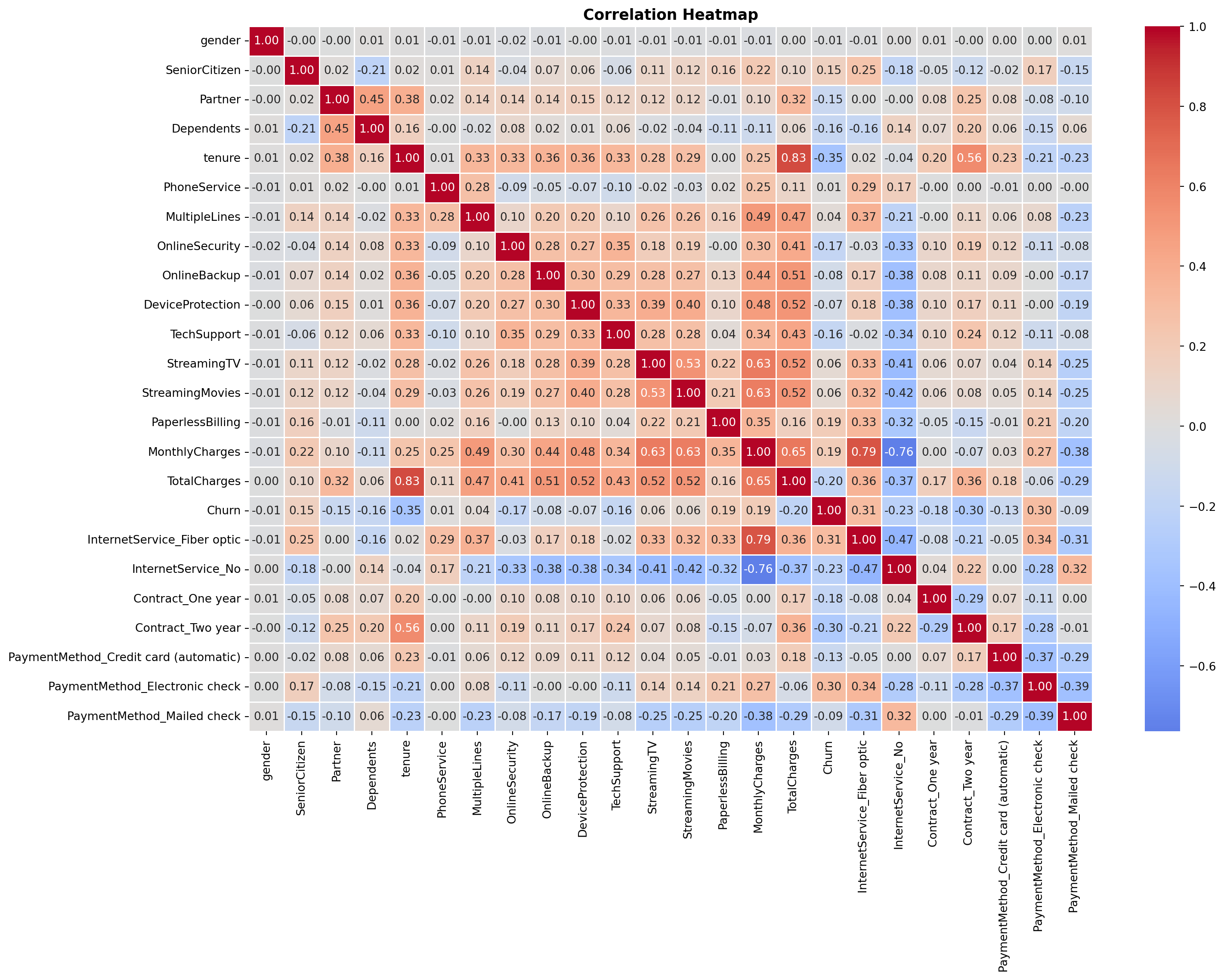
```{python}
#| label: correlation-heatmap
#| fig-cap: "Correlation Heatmap - All Features (Sammy)"
# Full correlation heatmap across all encoded features (Sammy)
plt.figure(figsize=(16, 12))
sns.heatmap(df.corr(), annot=True, fmt='.2f',
            cmap='coolwarm', center=0, linewidths=0.5)
plt.title('Correlation Heatmap', fontsize=13, fontweight='bold')
plt.tight_layout()
plt.show()
```
The **correlation heatmap** ^[Reading the heatmap: Each cell shows the Pearson correlation coefficient $r$ between the row variable and the column variable, ranging from -1 to 1. Red cells indicate a positive relationship (both variables tend to move together); blue cells indicate a negative relationship (one rises as the other falls); white or near-zero cells indicate little linear association. The matrix is symmetric, meaning that the cell at row $i$, column $j$ is identical to row $j$, column $i$, so only one rectangle carries new information. Diagonal cells are always 1.00 (a variable is perfectly correlated with itself). To read churn predictors specifically, scan the `Churn` row or column: red values flag features positively associated with churn, blue values flag features negatively associated with churn.] shows the pairwise **Pearson correlation coefficient** ^[The Pearson coefficient only captures *linear* relationships between two variables. Two variables can have a strong curved or non-monotonic relationship and still produce an $r$ near zero, meaning the heatmap may understate some associations. For this analysis the limitation is acceptable: logistic regression models the log-odds of churn as a linear function of the predictors, so linear correlation is the appropriate screening tool.] between every pair of variables after preprocessing. Among the numeric variables, `tenure` has the strongest relationship with churn (correlation of `{python} f"{tenure_churn_corr:.2f}"`), meaning longer-tenured customers are less likely to leave. `MonthlyCharges` has a weaker but positive relationship (`{python} f"{monthly_churn_corr:.2f}"`), meaning higher bills are associated with slightly higher churn. `TotalCharges` is largely redundant with `tenure` (correlation of `{python} f"{total_charges_tenure_corr:.2f}"`), which is why it was excluded from the models.
## Methodology
### Data Preprocessing
Binary variables were encoded directly using `.map()`, and columns with a redundant "No service" category were collapsed into a simple Yes/No before encoding. Multi-category nominal columns (`InternetService`, `Contract`, `PaymentMethod`) were one-hot encoded using `pd.get_dummies()` to avoid implying a false ordering between categories. Features were then standardized so that no single variable dominates the model due to its scale. The data was split into `80%` for training and `20%` for testing, with the split done in a way that preserves the same churn rate in both sets.
```{python}
#| label: preprocessing
X = df.drop(columns=['Churn', 'TotalCharges'])
y = df['Churn']

X_train, X_test, y_train, y_test = train_test_split(
    X, y, test_size=0.2, random_state=42, stratify=y)

n_train = X_train.shape[0]
n_test  = X_test.shape[0]

print(f"Training set: {n_train} observations")
print(f"Test set:     {n_test} observations")
print(f"Churn rate - Train: {y_train.mean():.3f} | Test: {y_test.mean():.3f}")
```
The training set contains `{python} f"{n_train:,}"` observations and the test set contains `{python} f"{n_test:,}"`, with a churn rate of `{python} f"{y_train.mean():.1%}"` in both sets confirming the *stratified split* ^[Stratified splitting preserves the proportion of the
target class in each subset. Without it, a purely random split could by chance assign
disproportionately few churners to the test set, making recall and precision estimates
unreliable. With `stratify=y`, scikit-learn splits churners and non-churners separately,
takes 80% of each group, and combines them, guaranteeing that both sets mirror the
original 26.6% churn rate. This is especially important here given the class imbalance
(73.4% no churn vs. 26.6% churn).] worked correctly. After one-hot encoding, the feature space expanded from `{python} f"{n_features_base}"` base features to `{python} f"{n_features_model}"` features in the interaction model (which adds four contract × internet service terms).
### Logistic Regression Models
We built two models. The **baseline model** uses all available features after pre-processing. The **interaction model** extends the baseline by adding four interaction terms that capture the combined effect of contract type and internet service on churn: one-year contract × fiber optic, two-year contract × fiber optic, one-year contract × no internet, and two-year contract × no internet. Since month-to-month and DSL are the reference categories, their effects are captured in the model intercept and serve as the baseline against which all other combinations are compared.
Logistic regression was chosen because its output is easy to interpret. Each coefficient tells you the direction and size of a variable's effect on the odds of churning. Given the business goal, **churn recall was treated as the most important metric**, because missing a customer who is about to leave is more costly than incorrectly flagging one who would have stayed.
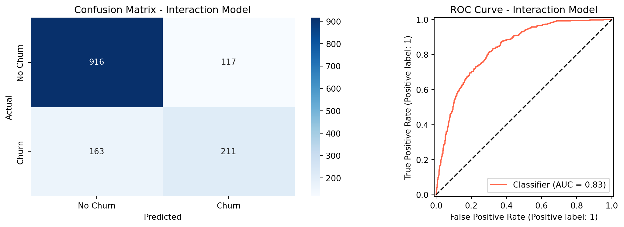
## Results
### Model Performance
```{python}
#| label: model-results
#| fig-cap: "Confusion Matrix and ROC Curve - Interaction Model"
X_train_int = X_train.copy()
X_test_int  = X_test.copy()

# Four interaction terms (Harrison)
X_train_int['Contract1_x_FiberOptic'] = X_train['Contract_One year'] * X_train['InternetService_Fiber optic']
X_train_int['Contract2_x_FiberOptic'] = X_train['Contract_Two year'] * X_train['InternetService_Fiber optic']
X_train_int['Contract1_x_NoInternet'] = X_train['Contract_One year'] * X_train['InternetService_No']
X_train_int['Contract2_x_NoInternet'] = X_train['Contract_Two year'] * X_train['InternetService_No']

X_test_int['Contract1_x_FiberOptic'] = X_test['Contract_One year'] * X_test['InternetService_Fiber optic']
X_test_int['Contract2_x_FiberOptic'] = X_test['Contract_Two year'] * X_test['InternetService_Fiber optic']
X_test_int['Contract1_x_NoInternet'] = X_test['Contract_One year'] * X_test['InternetService_No']
X_test_int['Contract2_x_NoInternet'] = X_test['Contract_Two year'] * X_test['InternetService_No']

scaler_int = StandardScaler()
X_train_int_scaled = scaler_int.fit_transform(X_train_int)
X_test_int_scaled  = scaler_int.transform(X_test_int)

lr_int = LogisticRegression(random_state=42, max_iter=1000)
lr_int.fit(X_train_int_scaled, y_train)

y_pred_int  = lr_int.predict(X_test_int_scaled)
y_proba_int = lr_int.predict_proba(X_test_int_scaled)[:, 1]

roc_auc_int         = roc_auc_score(y_test, y_proba_int)
report_int          = classification_report(y_test, y_pred_int,
                                            target_names=['No Churn','Churn'],
                                            output_dict=True)
accuracy_int        = report_int['accuracy']
churn_recall_int    = report_int['Churn']['recall']
churn_precision_int = report_int['Churn']['precision']
churn_f1_int        = report_int['Churn']['f1-score']

print("=== Interaction Model Performance ===")
print(f"ROC-AUC: {roc_auc_int:.4f}")
print(classification_report(y_test, y_pred_int, target_names=['No Churn','Churn']))

fig, axes = plt.subplots(1, 2, figsize=(12, 4))
cm = confusion_matrix(y_test, y_pred_int)
sns.heatmap(cm, annot=True, fmt='d', cmap='Blues', ax=axes[0],
            xticklabels=['No Churn','Churn'], yticklabels=['No Churn','Churn'])
axes[0].set_title('Confusion Matrix - Interaction Model')
axes[0].set_ylabel('Actual')
axes[0].set_xlabel('Predicted')
RocCurveDisplay.from_predictions(y_test, y_proba_int, ax=axes[1], color='tomato')
axes[1].plot([0,1],[0,1],'k--')
axes[1].set_title('ROC Curve - Interaction Model')
plt.tight_layout()
plt.show()
```
The interaction model achieved an ROC-AUC of `{python} f"{roc_auc_int:.4f}"`, exceeding the target of `0.80`. Overall accuracy was `{python} f"{accuracy_int:.1%}"`, just under the `80%` target. Churn recall at the default threshold of `0.50` was `{python} f"{churn_recall_int:.1%}"`, which falls short of the `75%` target. The weighted average recall of 80% seen in the classification report is misleading here: it is pulled upward by how well the model predicts the much larger non-churn class, which has nearly three times as many customers. The churn-specific recall is the honest metric for this business goal, and the threshold tuning section below addresses it directly.
```{python}
#| label: likelihood-ratio-test
from scipy import stats
import statsmodels.api as sm

# Prepare features - baseline (no interaction terms)
scaler_base = StandardScaler()
X_train_base_scaled = scaler_base.fit_transform(X_train)
X_test_base_scaled  = scaler_base.transform(X_test)

# Add constant for statsmodels (intercept)
X_train_base_sm = sm.add_constant(X_train_base_scaled)
X_train_int_sm  = sm.add_constant(X_train_int_scaled)

# Fit both models with statsmodels
baseline_sm    = sm.Logit(y_train, X_train_base_sm).fit(disp=0)
interaction_sm = sm.Logit(y_train, X_train_int_sm).fit(disp=0)

# Likelihood Ratio Test
lr_stat = -2 * (baseline_sm.llf - interaction_sm.llf)
df_diff = interaction_sm.df_model - baseline_sm.df_model
p_value = stats.chi2.sf(lr_stat, df_diff)

print("=== Likelihood Ratio Test ===")
print(f"Baseline log-likelihood:    {baseline_sm.llf:.4f}")
print(f"Interaction log-likelihood: {interaction_sm.llf:.4f}")
print(f"LR statistic:               {lr_stat:.4f}")
print(f"Degrees of freedom:         {int(df_diff)}")
print(f"p-value:                    {p_value:.4f}")

# Individual coefficient p-values from interaction model
coef_pval_df = pd.DataFrame({
    'Feature':      X_train_int.columns,
    'Coefficient':  interaction_sm.params[1:],
    'p_value':      interaction_sm.pvalues[1:]
}).sort_values('Coefficient', key=abs, ascending=False).head(15)

lrt_pvalue   = p_value
lrt_stat     = lr_stat
lrt_df       = int(df_diff)
```
```{python}
#| label: lrt-viz
#| fig-cap: "Interaction Model Coefficients with Significance Levels"
def sig_label(p):
    if p < 0.001:  return '***'
    elif p < 0.01: return '**'
    elif p < 0.05: return '*'
    else:          return ''

coef_pval_df['sig'] = coef_pval_df['p_value'].apply(sig_label)

fig, ax = plt.subplots(figsize=(10, 7))
colors = ['tomato' if c > 0 else 'steelblue' for c in coef_pval_df['Coefficient']]
bars = ax.barh(coef_pval_df['Feature'], coef_pval_df['Coefficient'], color=colors)
ax.axvline(0, color='black', linewidth=0.8)

for bar, (_, row) in zip(bars, coef_pval_df.iterrows()):
    x = bar.get_width()
    offset = 0.03 if x >= 0 else -0.03
    ha = 'left' if x >= 0 else 'right'
    ax.text(x + offset, bar.get_y() + bar.get_height() / 2,
            row['sig'], va='center', ha=ha, fontsize=12, fontweight='bold',
            color='black')

ax.set_title(
    'Top 15 Coefficients - Interaction Model\n(* p<0.05  ** p<0.01  *** p<0.001)',
    fontsize=12, fontweight='bold')
ax.set_xlabel('Coefficient (log-odds)')
ax.invert_yaxis()
plt.tight_layout()
plt.show()
```
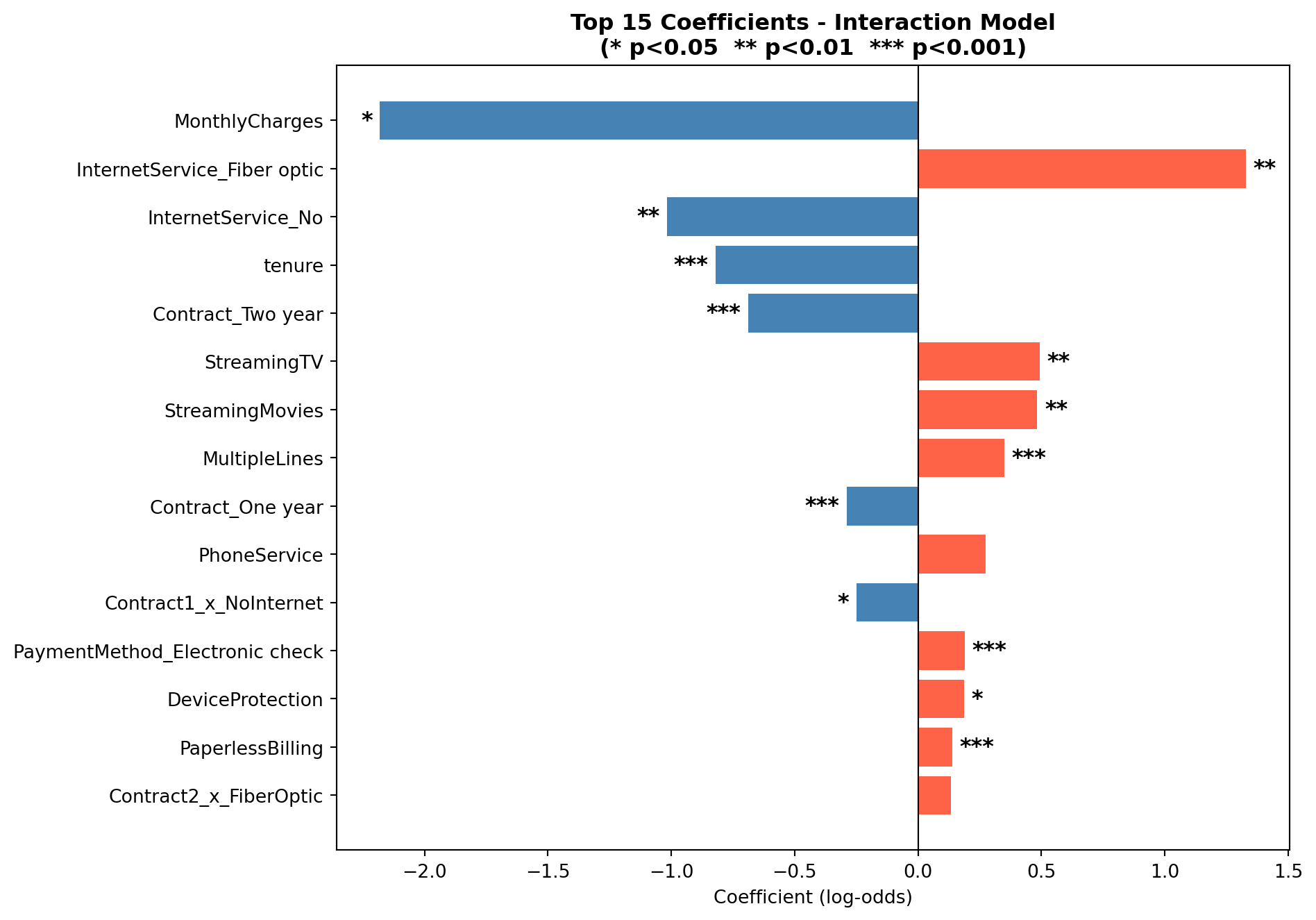
### Likelihood Ratio Test: Baseline vs. Interaction Model
The interaction model adds four terms to the baseline. To test whether this added
complexity is statistically justified, rather than just a chance improvement on the
training data, we use the **Likelihood Ratio Test (LRT)**. The LRT compares how well
each model fits the data by looking at their log-likelihoods: a model that fits better
will assign higher probability to the outcomes it actually observed. ^[The Likelihood
Ratio Test statistic is calculated as $-2(\ell_0 - \ell_1)$, where $\ell_0$ is the
log-likelihood of the baseline model and $\ell_1$ is the log-likelihood of the
interaction model. Under the null hypothesis that the interaction terms have no effect,
this statistic follows a chi-squared distribution with degrees of freedom equal to the
number of added terms. In this case, 4. A p-value below 0.05 indicates the interaction
model fits the data significantly better than the baseline.]
The null hypothesis is that the four interaction terms contribute nothing (the
baseline model fits the data just as well). A p-value below 0.05 means we can reject
that and conclude the interactions carry real signal. The chart above shows the top 15
coefficients from the interaction model, with significance stars indicating which
individual terms are statistically distinguishable from zero.
The LRT yielded a chi-squared statistic of `{python} f"{lrt_stat:.2f}"` with `{python} f"{lrt_df}"` degrees of freedom (p = `{python} f"{lrt_pvalue:.3f}"`). Since p < 0.05, we reject the null hypothesis and conclude that the interaction terms jointly improve model fit in a statistically meaningful way. Looking at individual coefficients, `Contract1_x_NoInternet` was the only interaction term significant at the 0.05 level (p = 0.018), meaning that one-year contract holders with no internet service have a meaningfully lower churn probability than the month-to-month DSL reference group, beyond what either variable explains on its own. The other three interaction terms (`Contract2_x_FiberOptic`, `Contract2_x_NoInternet`, and `Contract1_x_FiberOptic`) did not reach statistical significance individually (p = 0.18, 0.54, and 0.55 respectively), suggesting their effects are captured largely by the main contract and internet service terms already in the model.
### Threshold Tuning
By default, the model predicts churn when the estimated probability is `0.50` or higher. Lowering this cutoff means the model flags more customers as likely churners, which improves recall at the cost of flagging some customers who would have stayed. The table below shows how performance changes across different thresholds.
```{python}
#| label: threshold-tuning
thresholds = [0.30, 0.35, 0.40, 0.45, 0.50]
rows = []
for t in thresholds:
    y_pred_t = (y_proba_int >= t).astype(int)
    report = classification_report(y_test, y_pred_t,
                                   target_names=['No Churn','Churn'],
                                   output_dict=True)
    rows.append({
        'Threshold': t,
        'Accuracy':  f"{report['accuracy']:.3f}",
        'Churn Recall': f"{report['Churn']['recall']:.3f}",
        'Churn Precision': f"{report['Churn']['precision']:.3f}",
        'F1 Score': f"{report['Churn']['f1-score']:.3f}"
    })

threshold_df = pd.DataFrame(rows)
t30 = threshold_df[threshold_df['Threshold'] == 0.30].iloc[0]
t30_recall    = float(t30['Churn Recall'])
t30_precision = float(t30['Churn Precision'])

threshold_df.style.hide(axis='index')
```
At a threshold of `0.30`, the model catches `{python} f"{t30_recall:.1%}"` of actual churners, meeting the recall target from the proposal. The trade-off is that precision drops to `{python} f"{t30_precision:.1%}"`, meaning about half of the customers the model flags would not have actually churned. In a retention context this is an acceptable trade-off: reaching out to a loyal customer with a discount offer costs little, while doing nothing about a customer who is about to leave is far more expensive.
### Cross-Validation
To check that the model's performance holds up on data it has not seen before, we ran 5-fold cross-validation on the training set.
```{python}
#| label: cross-validation
cv = StratifiedKFold(n_splits=5, shuffle=True, random_state=42)
scoring = {
    'accuracy': 'accuracy',
    'roc_auc':  'roc_auc',
    'recall':   make_scorer(recall_score),
    'f1':       'f1'
}
cv_results = cross_validate(
    LogisticRegression(random_state=42, max_iter=1000),
    scaler_int.fit_transform(X_train_int),
    y_train, cv=cv, scoring=scoring)

cv_roc_mean = cv_results['test_roc_auc'].mean()
cv_roc_std  = cv_results['test_roc_auc'].std()

cv_df = pd.DataFrame({
    'Metric':  ['Accuracy', 'ROC-AUC', 'Recall', 'F1'],
    'Mean':    [cv_results[f'test_{m}'].mean() for m in ['accuracy','roc_auc','recall','f1']],
    'Std Dev': [cv_results[f'test_{m}'].std()  for m in ['accuracy','roc_auc','recall','f1']]
})
cv_df['Mean']    = cv_df['Mean'].map('{:.4f}'.format)
cv_df['Std Dev'] = cv_df['Std Dev'].map('{:.4f}'.format)
cv_df.style.hide(axis='index')
```
The results are consistent across all five folds. The ROC-AUC averaged `{python} f"{cv_roc_mean:.4f}"` with a standard deviation of `{python} f"{cv_roc_std:.3f}"`, meaning scores ranged roughly between 0.84 and 0.85 across folds, indicating the model is stable and not *overfitting* to the training data. A model that had simply memorized the training data would score well on training data but deteriorate on held-out chunks; the stability here indicates that is not happening. The cross-validation recall of 53.5% reflects the default threshold of 0.50, the same threshold used in the classification report, and is consistent with the threshold tuning results: at threshold 0.30, churn recall rises to 75.1% as shown in the previous section.
```{python}
#| label: random-forest
#| fig-cap: "Confusion Matrix and ROC Curve - Random Forest"
from sklearn.ensemble import RandomForestClassifier

# Train Random Forest on the same features as the interaction model
rf = RandomForestClassifier(n_estimators=100, random_state=42)
rf.fit(X_train_int_scaled, y_train)

y_pred_rf  = rf.predict(X_test_int_scaled)
y_proba_rf = rf.predict_proba(X_test_int_scaled)[:, 1]

roc_auc_rf      = roc_auc_score(y_test, y_proba_rf)
report_rf       = classification_report(y_test, y_pred_rf,
                                        target_names=['No Churn','Churn'],
                                        output_dict=True)
accuracy_rf     = report_rf['accuracy']
recall_rf       = report_rf['Churn']['recall']
precision_rf    = report_rf['Churn']['precision']

# Threshold tuning for Random Forest
y_pred_rf_t30    = (y_proba_rf >= 0.30).astype(int)
report_rf_t30    = classification_report(y_test, y_pred_rf_t30,
                                         target_names=['No Churn','Churn'],
                                         output_dict=True)
recall_rf_t30    = report_rf_t30['Churn']['recall']
precision_rf_t30 = report_rf_t30['Churn']['precision']
accuracy_rf_t30  = report_rf_t30['accuracy']

print("=== Random Forest Performance ===")
print(f"ROC-AUC: {roc_auc_rf:.4f}")
print(classification_report(y_test, y_pred_rf, target_names=['No Churn','Churn']))

fig, axes = plt.subplots(1, 2, figsize=(12, 4))
cm_rf = confusion_matrix(y_test, y_pred_rf)
sns.heatmap(cm_rf, annot=True, fmt='d', cmap='Greens', ax=axes[0],
            xticklabels=['No Churn','Churn'], yticklabels=['No Churn','Churn'])
axes[0].set_title('Confusion Matrix - Random Forest')
axes[0].set_ylabel('Actual')
axes[0].set_xlabel('Predicted')
RocCurveDisplay.from_predictions(y_test, y_proba_rf, ax=axes[1], color='seagreen')
axes[1].plot([0,1],[0,1],'k--')
axes[1].set_title('ROC Curve - Random Forest')
plt.tight_layout()
plt.show()

# Comparison table
comparison = pd.DataFrame({
    'Metric': ['ROC-AUC', 'Accuracy (t=0.50)', 'Churn Recall (t=0.50)',
               'Churn Recall (t=0.30)', 'Churn Precision (t=0.30)'],
    'Logistic Regression': [f"{roc_auc_int:.4f}", f"{accuracy_int:.1%}",
                             f"{churn_recall_int:.1%}", f"{t30_recall:.1%}",
                             f"{t30_precision:.1%}"],
    'Random Forest':       [f"{roc_auc_rf:.4f}", f"{accuracy_rf:.1%}",
                             f"{recall_rf:.1%}", f"{recall_rf_t30:.1%}",
                             f"{precision_rf_t30:.1%}"]
})
comparison.style.hide(axis='index')
```
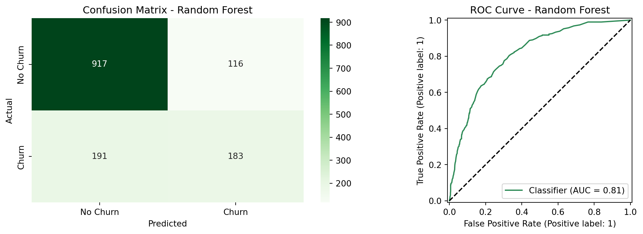
### Random Forest Comparison
To evaluate whether a more flexible model improves on the logistic regression, we trained
a Random Forest classifier on the same feature set. Random Forest builds many decision
trees on random subsets of the data and averages their predictions, which allows it to
capture non-linear relationships and complex interactions without requiring them to be
specified manually.^[Unlike logistic regression, Random Forest does not assume a linear
relationship between features and the log-odds of churn. It can detect patterns that
logistic regression misses, at the cost of interpretability. Coefficients with a clear
directional meaning are replaced by feature importance scores that measure how much each
variable reduces prediction error across all trees.] The table above compares the two models directly.
The Random Forest achieved a ROC-AUC of `{python} f"{roc_auc_rf:.4f}"`, compared to `{python} f"{roc_auc_int:.4f}"` for the logistic regression which is a meaningful gap in overall discriminative ability. At the default threshold of 0.50, the Random Forest also underperformed on recall (`{python} f"{recall_rf:.1%}"` vs. `{python} f"{churn_recall_int:.1%}"`) and accuracy (`{python} f"{accuracy_rf:.1%}"` vs. `{python} f"{accuracy_int:.1%}"`). At threshold 0.30, the two models converge closely: the Random Forest reaches `{python} f"{recall_rf_t30:.1%}"` churn recall vs. `{python} f"{t30_recall:.1%}"` for logistic regression, with nearly identical precision (`{python} f"{precision_rf_t30:.1%}"` vs. `{python} f"{t30_precision:.1%}"`). The McNemar's test in the next section confirms whether this remaining difference is statistically meaningful.
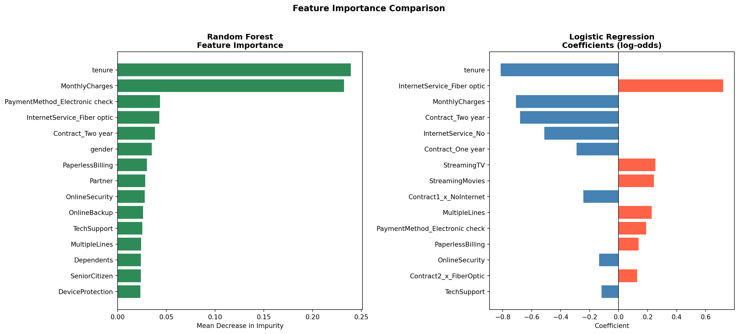
```{python}
#| label: rf-feature-importance
#| fig-cap: "Feature Importance Comparison: Random Forest vs. Logistic Regression"
# Random Forest feature importances
rf_importance = pd.DataFrame({
    'Feature':    X_train_int.columns,
    'Importance': rf.feature_importances_
}).sort_values('Importance', ascending=False).head(15)

# Logistic Regression top 15 coefficients by absolute value
feature_names = list(X_train_int.columns)
coef_df = pd.DataFrame({
    'Feature':     feature_names,
    'Coefficient': lr_int.coef_[0]
}).sort_values('Coefficient', key=abs, ascending=False).head(15)

top_pos_feature = coef_df[coef_df['Coefficient'] > 0].iloc[0]
top_neg_feature = coef_df[coef_df['Coefficient'] < 0].iloc[0]

fig, axes = plt.subplots(1, 2, figsize=(16, 7))

# Left: Random Forest importance
axes[0].barh(rf_importance['Feature'], rf_importance['Importance'], color='seagreen')
axes[0].set_title('Random Forest\nFeature Importance', fontweight='bold')
axes[0].set_xlabel('Mean Decrease in Impurity')
axes[0].invert_yaxis()

# Right: Logistic Regression coefficients
lr_colors = ['tomato' if c > 0 else 'steelblue' for c in coef_df['Coefficient']]
axes[1].barh(coef_df['Feature'], coef_df['Coefficient'], color=lr_colors)
axes[1].axvline(0, color='black', linewidth=0.8)
axes[1].set_title('Logistic Regression\nCoefficients (log-odds)', fontweight='bold')
axes[1].set_xlabel('Coefficient')
axes[1].invert_yaxis()

plt.suptitle('Feature Importance Comparison', fontsize=13, fontweight='bold', y=1.02)
plt.tight_layout()
plt.show()
```
Both models agree on the most important drivers of churn. `tenure` and contract type (`Contract_Two year`, `Contract_One year`) rank among the top predictors in both models, as does `InternetService_Fiber optic`. This convergence across two fundamentally different modeling approaches strengthens confidence that these variables reflect genuine patterns in the data rather than model-specific artifacts.
```{python}
#| label: mcnemar-test
from statsmodels.stats.contingency_tables import mcnemar

# Get predictions from both models at threshold 0.30
y_pred_lr_t30 = (y_proba_int >= 0.30).astype(int)
y_pred_rf_t30 = (y_proba_rf >= 0.30).astype(int)

# Build contingency table
both_correct = ((y_pred_lr_t30 == y_test) & (y_pred_rf_t30 == y_test)).sum()
lr_only      = ((y_pred_lr_t30 == y_test) & (y_pred_rf_t30 != y_test)).sum()
rf_only      = ((y_pred_lr_t30 != y_test) & (y_pred_rf_t30 == y_test)).sum()
both_wrong   = ((y_pred_lr_t30 != y_test) & (y_pred_rf_t30 != y_test)).sum()

contingency_table = [[both_correct, lr_only],
                     [rf_only,      both_wrong]]

result = mcnemar(contingency_table, exact=False, correction=True)

mcnemar_stat   = result.statistic
mcnemar_pvalue = result.pvalue

print("McNemar's Test Results")
print(f"Contingency table: {contingency_table}")
print(f"Chi-squared statistic: {mcnemar_stat:.4f}")
print(f"p-value: {mcnemar_pvalue:.4f}")
```
### Statistical Model Comparison
Comparing two models by looking at their metrics alone does not tell you whether the
difference in performance is statistically meaningful or just due to chance. **McNemar's
test** addresses this directly: rather than comparing overall accuracy, it looks specifically
at the cases where the two models *disagree* (where one got it right and the other got
it wrong). ^[McNemar's test is the standard non-parametric test for comparing two classifiers
evaluated on the same test set. It builds a 2×2 contingency table of agreements and
disagreements between the two models, and tests whether the off-diagonal cells (the
cases where only one model was correct) are symmetric. A p-value below 0.05 indicates
the two models make meaningfully different errors, i.e. the performance difference is
unlikely to be due to chance. It is preferred over a simple accuracy comparison because
it accounts for the paired nature of the predictions.]
Both models were evaluated at threshold 0.30, consistent with the threshold tuning
results above. A p-value below 0.05 would indicate the two models make meaningfully
different errors and that the performance gap is statistically significant.
The test yielded a chi-squared statistic of `{python} f"{mcnemar_stat:.2f}"` and a p-value of `{python} f"{mcnemar_pvalue:.3f}"`. Since p > 0.05, we cannot conclude that the two models make meaningfully different errors on this test set since the performance gap is not statistically significant. This is an important finding: despite the Random Forest's added flexibility, it does not outperform the simpler logistic regression in a way that can be distinguished from chance. Given that logistic regression also offers interpretable coefficients and p-values that directly support the inferential goal of this analysis, it is the preferred model for this use case.
### Feature Importance
Red bars in the logistic regression coefficient chart indicate variables that increase the likelihood of churn, while blue bars indicate variables that reduce it. `MonthlyCharges` (`{python} f"{top_pos_feature['Coefficient']:+.2f}"`) and `tenure` (`{python} f"{top_neg_feature['Coefficient']:+.2f}"`) remain the two strongest individual predictors. Among the interaction terms, two-year fiber optic customers show the highest churn risk of all contract-service combinations, which may reflect customers locked into long-term contracts who feel under-served by their internet service. In contrast, customers on long-term contracts with no internet service show the lowest churn, suggesting that simpler, phone-only plans attract a more stable customer base.
## Conclusions
The logistic regression model shows that churn in this telecom dataset is quite predictable. At the default threshold, the interaction model achieves an ROC-AUC of `{python} f"{roc_auc_int:.4f}"` and overall accuracy of `{python} f"{accuracy_int:.1%}"`. By lowering the classification threshold to `0.30`, the model meets the project's churn recall target of 75%. Cross-validation confirms these results hold across different subsets of the data, with a stable ROC-AUC of `{python} f"{cv_roc_mean:.4f}"` across five folds.
Three findings stand out. First, contract type is the clearest signal: month-to-month customers churn at `{python} f"{mtm_churn:.1%}"`, compared to `{python} f"{two_yr_churn:.1%}"` for customers on two-year contracts. Second, monthly charges consistently increase churn risk, which points to price sensitivity as a real factor. Third, tenure works in the opposite direction: customers who have been around longer are much less likely to leave. This means early retention efforts are especially valuable.
The Likelihood Ratio Test confirmed that the interaction terms jointly improve model fit (p = `{python} f"{lrt_pvalue:.3f}"`), though only one of the four individual interaction terms (one-year contract holders with no internet service) reached statistical significance on its own. Comparing the logistic regression against a Random Forest showed that the more flexible model did not produce meaningfully better predictions: the McNemar's test returned p = `{python} f"{mcnemar_pvalue:.3f}"`, and both models agreed on the same top predictors. This convergence supports choosing the simpler, more interpretable logistic regression for this use case.
## Practical Implications
The model's output can feed directly into retention programs:
**Contract upgrade offers:** Customers on month-to-month contracts with a predicted churn probability above `0.30` are the highest-priority group for outreach. Offering a discounted upgrade to an annual contract could meaningfully reduce the `{python} f"{mtm_churn:.1%}"` churn rate in this segment.
**Pricing reviews:** Customers with high monthly bills are more likely to churn. Loyalty discounts or bundle offers targeted at high-charge customers in the top risk group could improve retention without broad price cuts.
**Fiber optic service:** The `{python} f"{fiber_churn:.1%}"` churn rate among fiber optic users is worth investigating separately. It may reflect service reliability issues, pricing relative to competition, or unmet expectations. A focused customer satisfaction review in this segment would help identify the root cause.
**Early customer engagement:** Since short tenure is one of the strongest signals of churn risk, putting more resources into the customer experience during the first year of service could improve long-term retention rates and increase the overall value of the customer base.
::: {.callout-note collapse="true"}
## 🤖 AI Assistance Disclosure
Portions of this project were completed with the assistance of Claude (Anthropic). AI assistance was used in the following areas: structuring and writing the Quarto `.qmd` document, setting up the GitHub Actions workflow for GitHub Pages deployment, and debugging Python code errors during development. All of the base code (EDA + Models), analytical decisions, interpretations, and conclusions are the authors' own.
:::